Home About Links Hobbycraft Photos Downloads
Tom Sawyer
“Cod Liver Oil”
|
This illustration is reminiscent of when mothers gave their children a spoon full of Cod Liver Oil and a spoon full of Castor Oil every morning. The taste was pretty bad, and little evidence that it was really a benefit to children’s health or not.. although it wasn’t harmful. But, quite strange at the time, why just kids were fed such “yuckie” tasting stuff! It’s understandable to relate Tom’s expression of bracing himself for his “torture”, and his Aunt Polly determined to get it down his gullet. Actually, he wasn’t really sick in the story, just depressed because he was worried about Becky Thatcher, who had been home sick in bed for several days. But, his Aunt was obsessed with quack remedies, and was trying everything in her arsenal to bring Tom back to his normal self.
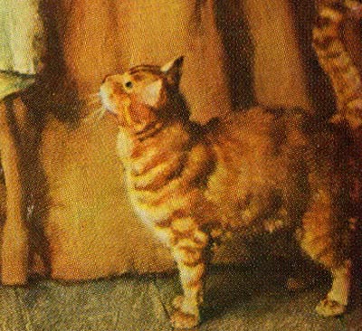
Rockwell believed that a story illustration had to stand alone, even without a caption. It had to be clear and understandable what was taking place. That is the way he approached his magazine covers, which generally had no captions, and that is how he approached his advertising and story illustrations. And, in typical Rockwell fashion, with simple clarity and touches of humor, he describes a scene that many of us can relate to in our own lives. Rockwell had the understanding and skill to tie his main elements together, connecting them physically and emotionally. Aunt Polly’s body bent at the waist, is in an upside down “L” shape, vertically and then horizontally. Her forearm is parallel with her upper body, and the spoon is nearly connecting with Tom’s mouth. Tom’s body is also an ”L” shape, but reversed .. vertical upper body, horizontal lower body, bent at the knees, then diagonally back to the chair. Both figures are rigid, adding to the tension of the moment. The cat is curiously observing, probably wondering if he/she will get a spoonful, also. The use of white is also particularly effective in connecting the two figures. The white apron connects to the white tablecloth, which connects to the white towel on Tom’s lap. Everything is rendered in solid muted colors, except for the blanket wrapped around Tom, which gives an accent in both color and pattern. It also helps avoid the larger shape of Aunt Polly’s dress from dominating the scene.
To avoid drawing too much attention to the cat, who was described as being “a yellow cat” in the story, Rockwell echoes the same color for Aunt Polly’s dress.
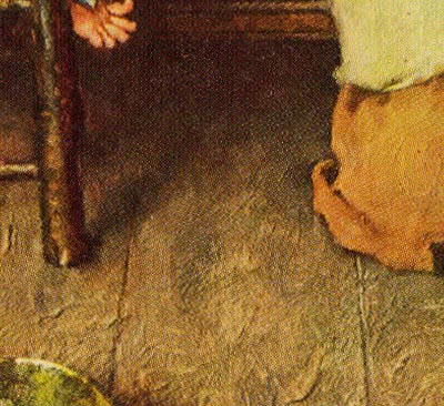
Picking out the right characters and props and then posing them, came after Rockwell had carefully composed the entire scene, by experimenting with a variety of approaches on paper first. Tying elements together and balancing the dark and light patterns to lead our eye, and counter change elements for clarity, were the less obvious ingredients.. yet every bit as important. And, they required a more subtle and sophisticated knowledge and understanding, that I find primarily in the truly great illustrators. Notice the thicker paint texture on the floor, giving a rustic effect to the well used wood floors. Many illustrators would be tempted to show wall paper and more props that could be in the kitchen, but Rockwell distills it down to only a suggestion of the kitchen.
He uses his props to suggest the period in history, a sense of place and as a compositional device. He carefully places them in the composition to avoid distraction, and give visual balance. Notice how the chest behind Aunt Polly’s skirt is blended into the dark wall
... and the clock above it is just hinted at, nearly unnoticeable.
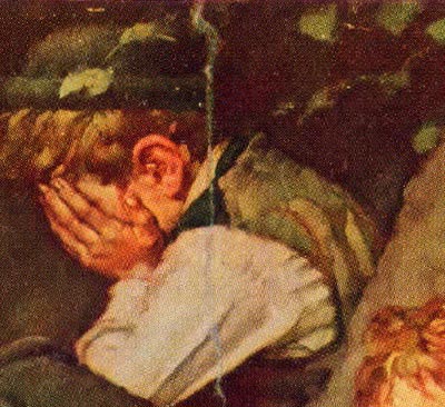
There is no horizontal baseboard showing where the floor meets the wall (purposely obscured in shadow) on the left side.. just a hint of baseboard under the table. All these decisions function to focus our attention on the important action of the scene. So many times, illustrations that are over rendered with detail from corner to corner, an overabundance of dramatic color effects, and so much to look at that it boggles my mind and my eyes. Rockwell is an excellent example that when composing a picture “you can say more with less”, providing that you are selective and have a firm understanding of effective design. It has always been a temptation for kids to show off by smoking with their friends and act like it’s no big deal. Rockwell portrays a worldly wise Huckleberry Finn, enjoying a pipe full of tobaccy, which he did regularly.. and Tom and a friend are not feeling so great from not being accustomed to smoking. Again, Rockwell cuts right to the chase and only shows what is necessary to illustrate the moment.
The composition runs in a strong left to right diagonal and to relieve the movement, the boy on the left (I think is Tom) leans over, face in hands, giving subtle opposition to the strong diagonal direction.
The two boy’s pipes lay on the grass, as they are in obvious misery. Instead of becoming intrigued with the characteristics of the limbs and branches of an interesting tree (like in a landscape painting), Rockwell simply suggests a large gnarly trunk leaning strongly to the right. He has even avoided the temptation of including the detail of bark, or a hole from a dead limb. The focus is smack dab on the boys, specifically Huck.
Rockwell adds reflective green from the grass and leaves, into the tree trunk, clothing and subtle suggestions in the flesh tones. The well placed unit of the straw hat and stick, point into the composition, and break up an otherwise large mass of green grass.
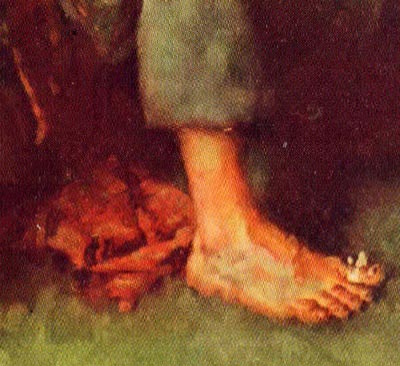
Even the pipe stems point inward toward each boy, keeping our eye from wandering away from the subject. Rockwell was a master at facial expressions, which he was noted for, and I could also point out that he was brilliant at painting expressive feet and hands. That was his stock and trade, animated expressions, bare foot kids, expressive hands and a variety of lovable and very real looking dogs and cats.
Notice the red handkerchief shows up once again as a compliment and accent to all the green tones. And, once again, we see the cloth wrapped around the big toe of the boy on the right.. must have been before the invention of the Band-Aid.
Rockwell was quite clever at connecting his figures together, knowing how to give variety and develop interesting shapes. He analyzes every pose and every shape, determining the clarity and benefit to the overall design. Working out the concept, composition, costumes, props, models, careful drawing and a variety of color roughs, were all crucial in solving as many problems as possible before doing the finish painting. For many illustrators, so much planning ahead would be too time consuming, and they would lose patience and inspiration. But, Rockwell never cut corners, and seemed to thrive on his exhausting procedure. His work ethic was amazing by anyone’s standards, and illustrating was literally his life. He was quoted as saying that there was nothing else he was good at, except doing illustrations. |