Home About Links Hobbycraft Photos Downloads
Tom Sawyer
“Schoolmaster”
|
Today
the schoolmaster switching Tom would be suspended and investigated for child
abuse, but in those days the schoolmaster was appropriately named.
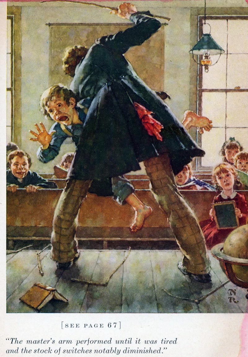
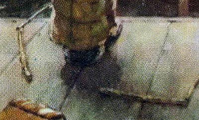
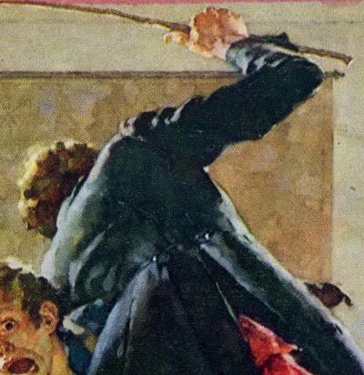
The action in this scene is intense, compared to the rest of the illustrations, and Rockwell conveys that feeling perfectly. The large triangular shape of the dark jacket of the schoolmaster, is menacing and adds to the tension. It also functions to counter change the light background. One can almost feel and see real movement in the two figures. It is so convincingly portrayed, that we can hear and feel the switch slapping against Tom’s pants and a convincing yelp. If the schoolmaster used his hand instead of a switch, Tom would hardly feel it, as his loose pants would shield him, having little effect. The humiliation of being switched in front of the whole class, was probably worse than the sting of the switch. Notice all the switches broken on the floor.
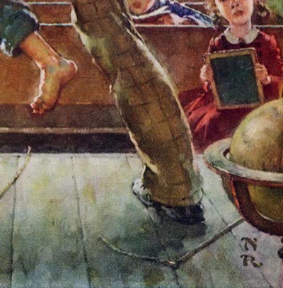
Again Rockwell uses the combination of angled figures (organic forms), and a flat background of horizontal and vertical lines (geometric forms). He liked the combination, and used it over and over to perfection. The lamp, the globe and the book on the floor create secondary visual interests. Rockwell never added props that were unnecessary, and never left out props that would explain the scene better. His understanding for clarity and authenticity, and his understanding of composition and design, were always compatible.
Rockwell combines an effective pattern of warm tones (map on wall, windows and frames, bench, schoolmaster’s pants, book on floor, the globe and the hair and skin tones).. cool tones are (the wall, lamp shade, Tom’s shirt and pants, schoolmaster’s jacket, student’s shirt and the floor). Warms and cools also function to counter change and separate the various shapes from each other. Again, he used the red handkerchief and the girls dress as red accents. Every decision Rockwell made was vital and functional.
Norman Rockwell commented in his biographical book “My Adventures As An Illustrator”, that he didn’t always choose to illustrate scenes that were of major importance to the story. As mentioned in the previous illustration, he said he “picked scenes that would make good paintings”. That may sound odd, but often a key scene in the story, does not always come off visually. Rockwell instinctively knew what made a “good picture”. He said that sometimes it would, in fact, be a scene that was described in just a few short sentences, and rather insignificant to the story. The scene of Tom climbing out of the window is but a brief moment in the book. But, it says volumes about the kind of boy Tom Sawyer was, and his mischievous adventuresome ways. He had the ability to convey that, perhaps better than almost any other illustrator. Rockwell’s ‘cut to the chase’, ‘straight ahead’ point of view in most of this compositions, leaves no doubt what is being depicted. He was a master at visually communicating an idea.
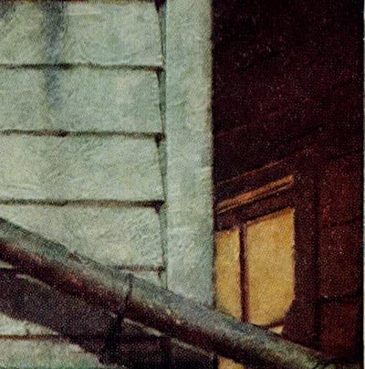
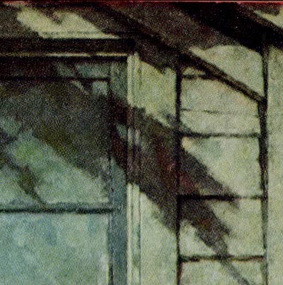
Rockwell painted from live models and stubbornly refused to use the camera that would later (after 1939) give him more flexibility and latitude for his compositions. This scene was obviously painted from a model in his studio, in a situation where he had complete control of the pose and lighting. Maintaining the right expression enabled him to more easily change his point of view by looking at the scene from below or from above the subject. But would that have really improved this illustration? Since it wasn’t a tension-filled moment, like Tom falling to the ground, being caught sneaking out, or getting stuck climbing down to the ground, etc., a dramatic approach to the composition would have been overkill and misleading. Even in the soft cool cast of moonlight, Rockwell shows as much clarity and resolve in the figure and clap board house as if it were broad daylight. He simply adds blue and green tones to all the hues, complementing them with an accent of bright yellow from the neighbor’s window and a hint of the angle on the neighbor’s roof, creates subtle opposing diagonals.
This helps relieve the stronger diagonals of the eves, the pipe and the tree shadows on the house. For the most part, the house and window are depicted in patterns of geometric horizontal and vertical lines, which Rockwell often used in his compositions.
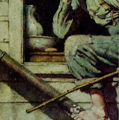
The water pitcher, wash basin, soap and the strip of cloth wrapped around Tom’s toe, are typical descriptive subtleties that Rockwell became identified with for most of his illustrations.
|