Home About Links Hobbycraft Photos Downloads
Tom Sawyer
“Dogs”
|
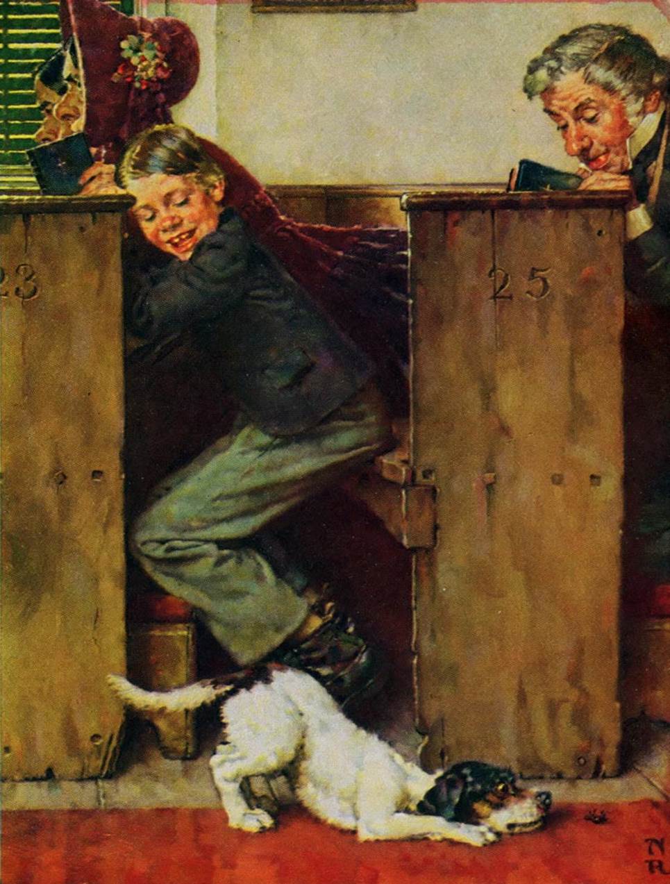
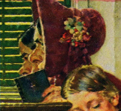
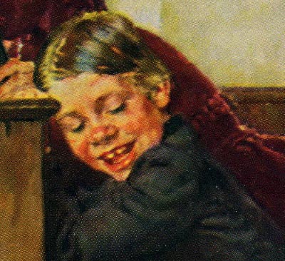
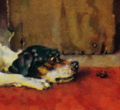
A boy and a dog was a familiar pair in many Rockwell Saturday Evening Post covers and calendar illustrations. Until the late 1930’s, he exclusively used live models to directly draw and paint his characters, sometimes including animals and birds, if they didn’t move too much. It was an important step in his procedure to get just the right pose and draw and paint directly from his models. Posing the dog just right with the right expression for the situation was paramount. He observed the gesture and body language of animals as well as people, with great care and concern. That gesture with the rear end up and the head and chest on the floor, and eyes wide open with curiosity. Once again, Rockwell wove a tight-knit cohesive composition that rapidly connects Tom Sawyer to the dog, which are the two main subjects. The entire composition could be a scene on a stage for a play, as though we were sitting in the front row of the theater. There is virtually no linear perspective, but we still get a literal sense of depth and space through a careful and accurate arrangement of tonal values. There are essentially three major levels of depth, the foreground (floor and dog), the middle ground (the pews, Tom and the man behind him), and the background (the two ladies next to Tom, the wall and window blinds). Tom’s body quickly leads us to the dog and visa versa. Notice how vague the features of the two ladies are, as the bonnet nearly cover their faces. The blinds on the window also help obscure their faces so we don’t visually linger in that corner of the scene. The dark strip on the right at the end of the pew and the man on the right, effectively brings us back into the scene. Rockwell has cleverly connected two points of interest. Tom’s expression and the dog’s expression are both important to the scene, yet they don’t compete for attention. Notice the clarity he painted in Tom’s face, showing a typical reaction of a boy being entertained by the dog eyeing the beetle, he can barely hold back even a giggle. Rockwell has distilled this scene down to it’s simplest and most direct form of communication. There is nothing superfluous or extraneous in a Rockwell illustration. It all functions to quickly and clearly describe the scene, with great visual interest and fine artistic taste. It takes sophisticated understanding of layout, design and composition, and Rockwell had an abundance of those qualities. The colors are primarily mid and dark tones, rich in browns and grays, with muted dark cool reds in the bonnet, and brighter warmer reds in the carpet. The red carpet helps bring attention and contrast to the mostly white dog. Rockwell seemed to be attracted to the texture and modeled color of old worn wooden structures, such as the pews. He obviously enjoyed bringing out the character and age of the pews with plenty of rustic detail. They were painted from sketches of the original pews in the church in Hannibal, that was described in Mark Twain’s book. |


