Home About Links Hobbycraft Photos Downloads
Tom Sawyer
“Frontispiece”
|
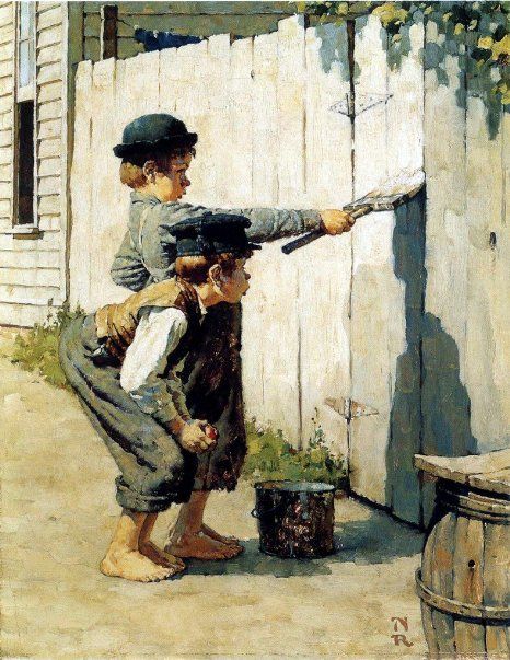
The first painting in the book epitomizes the entire book, and is fitting to be the frontispiece. It is a tight-knit perfectly balanced composition typical of Rockwell’s style in the 1930’s. I can’t imagine this scene being portrayed in any other way, and be more effective. Using an interesting combination of theatrical straight ahead profile for the figures, contrasted by a three dimensional linear perspective foreground and background, Rockwell cleverly and effectively stages a compelling and important opening illustration.
The background is deceptively simple, suggesting a corner of a rustic small town clap board house, attached to the house is a crude homemade planked fence and just a little suggestion of clothes drying on the line in the backyard. To stop the eye on the right side of the composition, is a corner of an old wooden barrel with a board covering the top. These simple yet charming touches are quite important in depicting period and location, yet not taking away attention from the main subject. No illustrator did that better than Norman Rockwell. He researched and selected props that not only tie together his finely tuned compositions but created just the right atmosphere of time and place. Rockwell knew the mannerisms and attitudes that kids normally display. Both Tom and his friend are convincing as typical boys, with convincing typical boy gestures. Rockwell’s powers of observation was truly remarkable, always finding the characters and the perfect gestures for a given situation. He was not afraid to exaggerate a pose or attitude of the character, in order to communicate his idea as clearly as possible. Throughout his career, he had a constant gnawing concern with virtually every illustration he did, worrying whether or not his concept would be clear to the viewer, which drove him to often correct, revise, change and even redo an illustration. In profile, the two boys overlap creating one combined shape that dominates most of the painting. The extended direction of the arm and paintbrush in Tom’s hand holding the paintbrush, is emphasized by the two boys looking directing down Tom’s arm. Both are concentrating and looking very serious. Their body language complements each other, giving a strong design to the combination of the two figures, one semi-crouched and the other standing with his back arched, and both boy’s heads are perfectly level. It is certain that Rockwell planned every inch of his composition for design, balance and effective use of directional devices. The background and foreground, for the most part is in full bright sunlight, depicting pale soft tones. And, the two boys are in a full range of rich tones that draws our attention to them. The freshly whitewashed fence directly behind the figures is very light in contrast to the deeper rich tones of the figures, adding even more emphasis on the boys. The shadow on the fence under the paint brush, cleverly leads down to the shadow on the ground, which leads to the boy’s feet. Even the corner of the board covering the barrel points to the two boys like an arrow. There is a nice balance of vertical, horizontal and diagonal lines and shapes, all working together to create interest, reality and strong compositional devices. Rockwell effectively painted the figures in a more literal fashion while leaving the rest of the painting more simply implied. He applied semi-loosely painted strokes, with just enough detail to satisfy most lovers of literal realistic illustrations. Rockwell’s paint strokes are consistent and accurate, yet free from tight over-rendered polished realism. |