Home About Links Hobbycraft Photos Downloads
Norman Rockwell Biography (part 2)
|
Early
examples of Rockwell's mature technique (which might be described as
"fictional" documentary, or synthetic documentary) are to be found
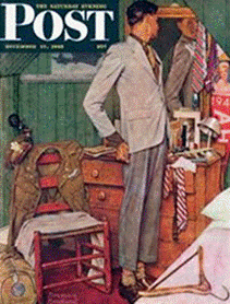
in the Willie Gillis covers, a series At the time he was looking for a suitable model for his Gillis, Rockwell was attending a square dance in Vermont; there he spotted a young man named Robert Buck who he thought would be exactly right. Even better, from a practical point of view, Buck was supposedly unfit for military duty; he would thus be available to pose for as many covers as Rockwell might care to paint around that particular character. After Rockwell had painted five Gillis covers, however, Buck succeeded in passing his physical and was inducted into the service, leaving Rockwell with the predicament of having invented a popular character—one who was making his quiet contribution to morale on the home front—but no model to paint him from. Rockwell hit on the solution of devising scenes in which the photographic likeness of Buck/Gillis could be used to stand in for the flesh and blood character. After the war, when Buck came back home, Rockwell used him as a live model once more, winding the series up with a portrayal of Willie's return to civilian life. The impression of this sequence of covers was that of a documentary portrait of one young man 's progress from the period immediately before Pearl Harbor to the period after V-J Day. In fact, of course, Willie Gillis was entirely a figment of Norman Rockwell's imagination—a symbolic protagonist designed to serve a specific purpose at a specific time. If there is anything atypical of Rockwell 's career in this, it is only the notion of using a single character over an extended period of time—a device that enabled Willie to come to seem like someone that everyone had known. The way in which a kind of synthetic "reality" was created—through the agency of the illustrator's imagination—from models, photographs, and sketches was, however, entirely characteristic of the kind of approach Rockwell would utilize throughout the latter part of his career. Generally,
then, each of Rockwell's protagonists is called upon just once, to grace a
single The
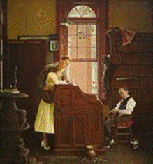
young couple portrayed in "Marriage License" might well move into
one of the houses we see in the background of "Commuters. " It is
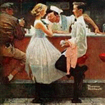
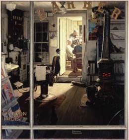
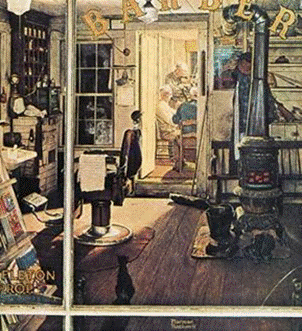
easy to imagine that the counterman we are shown in "After the Prom' has
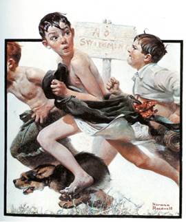
his hair cut on the premises presented in A Rockwell painting is immediately recognizable as a Rockwell painting. Clearly, he does have a style that is unlike any other. It is not easy to define, however, because it does not depend upon any broad mannerisms. It is, rather, made up of small but significant deviations from the photographic and academic norms. The best of his early works is, in general, more "painterly" than most of his later canvases, though these later canvases tended to make more successful covers. Being "painterly," is that they are conceived and executed more as conventional easel paintings, whereas the later works often have the look of tinted drawings (even though they are executed in oil paint on canvas). This difference should not be taken as a hard and fast rule, but it does represent a significant tendency, as a few examples will show. If we turn to the 1921 cover "No Swimming," we find that it has been painted in an almost impressionistic way.
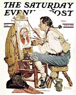
The
first color cover in 1926. George Horace Lorimer chose Rockwell for the
honor. Lorimer had an issue with the model, James K. Van Brunt, who had a
face only a mother and Norman Rockwell could love. Later
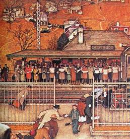
examples of Rockwell's cover art often show a very different approach. The
1946 cover
An
extreme example of the application of this technique occurs in the 1946 cover
"Commuters”. This is a composition governed almost entirely by carefully
As
the years passed, Rockwell learned to use any trick of the trade that would
lend itself to reproduction and hence contribute to the impact of the cover
itself. Correspondingly, he became less and less concerned with what was
correct from a strictly academic point of view. He realized, in short, that
he was not going to be judged as a conventional easel painter. Again and
again he would tell people, "I am not an artist. I am an illustrator.'
Rockwell's facility was such that he was equally at home whether he was
emphasizing the painterly aspects of his skills or demonstrating his
virtuosity as a draftsman. It seems to me, in fact, that his finest work
generally came about when he achieved some kind of balance between two
approaches, as happened from time to time throughout his career, especially
in the forties
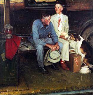
One suspects that Rockwell probably took this composition further than he had anticipated when he first painted it. The idea is rather conventional, but evidently it triggered something in Rockwell's imagination, and he brought more passion than usual to the painting, passion that is evident in the sheer richness of the pigment. Rockwell was a master of many techniques, then, and he used whatever means was necessary to get across his point. Certain things, however, are constant in his work from the very beginning. There was, for example, something immediately recognizable about the way he assembled the "props" for his paintings. He was never afraid of making the most obvious choices, nor was he afraid of organizing them in the most obvious way. Turning to "Breaking Home Ties" once more, it is full of deliberate contrasts that are anything but subtle. Notice the way the father's worn shoes have been pointedly contrasted with the son's shiny new ones. The word to describe this is—inescapably—"obvious. " There is something obvious, too, about the little still life to the left of the picture, made up of the signalman's flag and lamp set down so conveniently on the black trunk. Almost every decision that has been made in this wonderful composition is, essentially, obvious. |