Home About Links Hobbycraft Photos Downloads
Norman Rockwell Biography
|
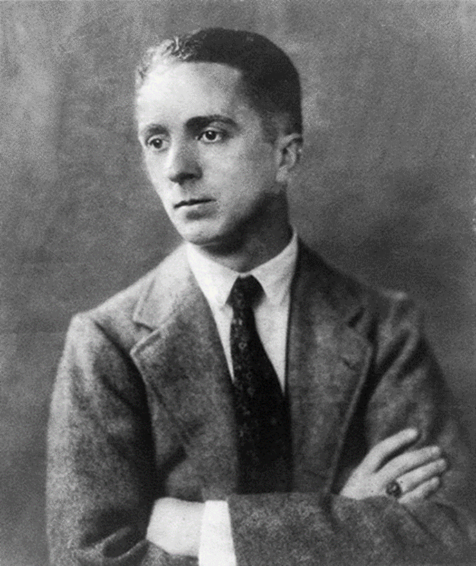
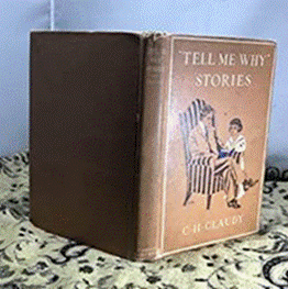
Norman Percevel Rockwell was America’s most loved illustrator who was initially insecure about his works, preferring to call them illustrations rather than art. But whatever they were called, he and his pieces gained fame and popularity because he was able to put across nostalgia in his works, a kind of utopia where everything was simple, and everyone was nice and kind – the American dream summed up. He told visual stories about everyday life; indeed, it was in his illustrations where one could feel and taste the American spirit. He shared the same hopes and dreams with everybody when he himself said, “I paint life as I would like it to be”, thus becoming both hero and friend to everybody. Norman Rockwell Portrayed Americans as Americans chose to see themselves. Rockwell was a prolific artist, producing more than 4,000 original works in his lifetime. Most of his surviving works are in public collections. Rockwell was also commissioned to illustrate more than 40 books as well as painting the portraits of presidents, foreign figures and celebrities. He created artwork for advertisements for many companies including Coca-Cola, Jell-O, General Motors, and Scott Tissue. Norman was born on February 3, 1894 in New York. He was the second child of Nancy Hill Rockwell and Jarvis Waring Rockwell, was their first-born son. Norman’s brother, Jarvis Jr, was a year and a half older than Norman. His father was Jarvis Waring Rockwell, Sr. and was a manager for a textile firm, while his mother was Anne Mary Hill. Born into a strict Christian home, his father was a Presbyterian, and his mother was an Episcopalian. The boys were not allowed to play with toys or read funny papers on Sunday. Two years after their engagement, Norman converted to the Episcopal faith. His earliest American ancestor was John Rockwell (1588–1662), from Somerset, England, who immigrated to colonial North America, probably in 1635, aboard the ship Hopewell and became one of the first settlers of Windsor, Connecticut. When
Norman was born, the Rockwell’s lived on the fifth floor of a brownstone
building on Norman spent several years as a choirboy at St. Luke’s and at the Cathedral of St. John the Divine Norman’s mother was often sick, and she stayed in bed a lot. So, Norman and Jarvis were often left to look after themselves. Norman did not feel loved at home, and sometimes felt very alone. At least Norman had his drawing. He was able to find comfort while sketching. And he was good at it. Every summer, the Rockwell family left New York City to spend time in the country. The family usually went to a farm in the Catskill mountains in upstate New York. It was a big change for Norman and Jarvis. They swam in ponds, fished in lakes, went on hayrides, and looked for frogs. Later in life, the memories played a big part in his career as an illustrator. In 1906, when Norman was twelve, the Rockwell’s moved out of New York City to a suburb called Mamaroneck. Twice a week he traveled by trolley train, and subway to attend classes at the New York School of Art and later the National Academy of Design. It took him two hours each way. At the end of his junior year, he dropped out of high school. It was too hard to go to high school in Mamaroneck, work part time, and take art classes in New York City. He decided to enroll full time at an art school called the Art Students League. So, at age seventeen, Norman packed his bags and pencils and headed back to New York City where he graduated. There were female students at the Art Students League, but men and women were not allowed to be in the same classes. Even as a student, Norman had shown both sense of humor and discipline.
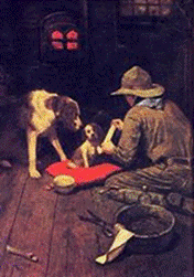
With the money he had made from book illustrations, he able to rent a studio. He was able to tell book and magazine publishers that he was already a published illustrator. Norman went to visit the office of the Boy Scouts of America. The Boy Scouts published a magazine called Boy’s Life and were planning to create a handbook for Boy Scouts. They asked Norman to create some illustrations for the handbook. The editor of the handbook was so impressed with what Norman drew that he asked him to become the art editor of Boy’s Life. He was only nineteen at the time. His salary was $50 a month.
The New York Armory Show of 1913 had introduced the American public to recent trends in European painting, but traditional values still reigned supreme in the American art world. Only a handful of artists aspired to anything more novel than the mild postimpressionism of painters like John Sloan and Maurice Prendergast. The movies were becoming a potent force in popular entertainment, but few people took them seriously or thought they might one day take their place alongside established art forms. It was a world in transition, but the transition had not yet accelerated to the giddy speed it would achieve in the twenties. People could be thrilled by the exploits of pioneer aviators without being conscious of the impact that flying machines would have on modern warfare. It was possible to enjoy the conveniences provided by such relatively new inventions as the telephone, the phonograph, the vacuum cleaner, and the automobile without being too troubled by the notion that technology might someday soon threaten the established order of things. The illustrator and cover artist working in the mid-teens of the twentieth century was generally asked to embody established values. By
the 1920s, Norman had also been doing The latest model Hupmobile Runabout might well be the subject of a given picture—an advertisement, perhaps—but the people who were shown admiring or driving in the newfangled vehicle were presumed to espouse the same values as their parents and their grandparents. The set of the jaw, the glint in the eye had not changed much since the middle of the nineteenth century. The women wore their hair a little differently, perhaps, and men were doing without beards, but these were superficial differences. The fact is that the minds of the people who edited and bought magazines like Colliers, Country Gentleman, Literary Digest, and The Saturday Evening Post had been formed, to a large extent, in the Victorian era. Norman Rockwell himself, born on the Upper West Side of Manhattan, had a classic late Victorian upbringing. He spent his childhood in a solidly middle-class, God-fearing household in which it was the custom for his father to read the works of Dickens out loud to the entire family. Thus, Rockwell had little difficulty in adapting to the conventions that were current in the field of magazine illustration at the outset of his career. Although a New Yorker, he was especially drawn to rural subject matter (he is on record as saying that he felt more at home in the country). This reinforced his affection for traditional idioms, since it focused his attention on the most conservative elements of the population, those who were least susceptible to change of any kind. In
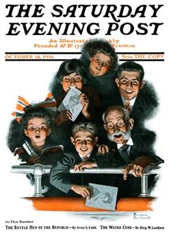
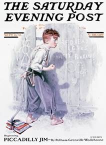
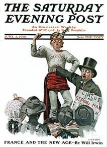
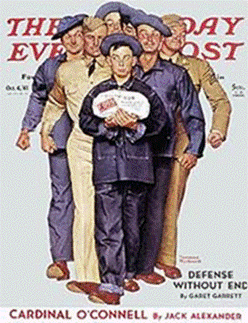
1916, Norman moved to another part of the city. He shared an Norman was thrilled to see his first Saturday Evening Post cover on May 20, 1916. “Two million subscribers and then their wives, sons, daughters, aunts, uncles, friends. Wow!” he said when the possibility of a Post cover arose. He accomplished this coveted feat at the age of twenty-two. Covers were printed with the two-color process: black and one other color, usually red. They were done in “duotone” until 1926, when the Post’s first color cover was done—again, by Norman Rockwell.
Within one year, Norman had already done 8 cover illustrations, and in the span of forty-seven years working for the Saturday Evening Post, he was able to do a total of 332 original cover illustrations. He also painted 158 story illustrations that appeared inside the magazine. Such was the popularity Norman had gained that the Post needed an automatic 250,000 increase in copies whenever the cover was done by him.
As Norman’s career with The Saturday Evening Post was getting established, the United States declared war against Germany. I was April 1917, and Norman wanted to help in the war effort. The recruiting office told him that he was too skinny to enlist. So, Noman stuffed himself with doughnuts, bananas, and water until he had gained the weight he needed. The Navy sent him to Charleston SC. When they discovered he was a talented artist, they had Norman create portraits of many officers, their wives, and lots of sailors. Norman was also allowed to continue creating covers for The Saturday Evening Post, as long as they had a military theme. He was discharged from the Navy in November 1918. Norman would spend hours and hours in his studio, but his wife, Irene, liked going out. When they were first married, they would go boating, play bridge, and golf with friends. They attended parties and invited people over to their house. Then with Norman spending more time in his studio, their social life quieted down, Irene still wanted to go out, but Norman was happy to stay at home and work. They divorced in 1929. Everyone
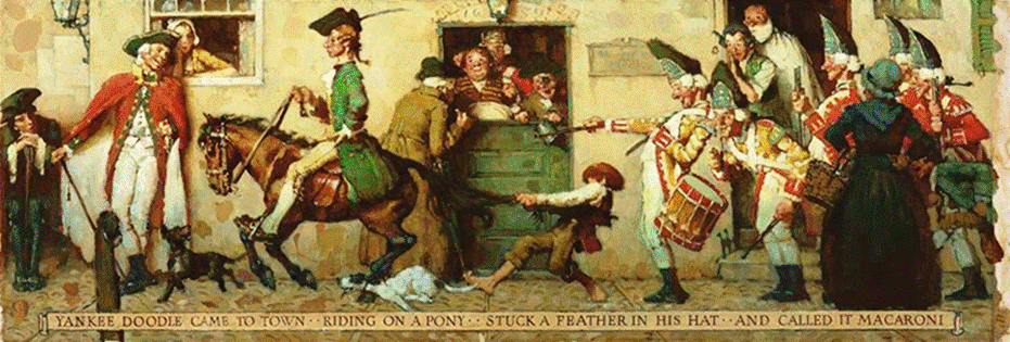
loved Normans covers, but Norman didn’t feel loved. He was Norman met Mary Barstow at a dinner party at the home of a friend (Clyde). She was 22 and he was 36. Mary was the type of woman he needed in his life. After just two weeks, Norman asked Mary to marry him. They were married April 17, 1930. The couple had three sons: Jarvis, born in 1931; Tom born in 1933; and Peter born in 1936. In 1935, Norman was commissioned by Heritage Press to do the art work for the deluxe edition of “Tom Sawyer” and “Huckleberry Finn”. He also did the illustrations for more than 40 other books, as well as illustrations for catalogs, stamps, music covers, and murals for an inn in New Jersey called Nassau Inn. He painted the 13-foot “Yankee Doodle Dandy” mural in 1937 which was a visual depiction of the song with the same title.
Norman started feeling insecure about his work, felt it was time for a change. After a trip to Europe, decided to move to Arlington Vermont, in 1938. The small New England town was peaceful, quiet, and friendly. It reminded Norman of the places where he and his family had spent their summers when he was a boy. Norman decided to turn a barn in Arlington into his studio. Lots of people dropped by the studio to watch their famous neighbor work. Norman made time to take breaks from work. He and Mary went square dancing every week. Norman felt happy again about his life and his work. During
World War II, Norman created several series which featured fictional characters
he himself created for The Post. These series were believed to be Norman’s
contribution to the There
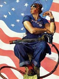
is also Rosie the Riveter. This fictional character created by Norman in 1943
served as a cultural icon She was a symbol of women empowerment. So powerful and moving were Norman’s illustrations that as much as 11,000,000 women began volunteering for assembly line work. Some of the more famous Rosie the Riveter illustrations depicted Rosie taking a lunch break with a rivet gun resting on her lap, another was Rosie reading a book by Karl Marx, and another was Rosie inside the cockpit of a fighter plane while another woman was refueling it. Norman’s second wife, Mary, died in 1959. In 1961, he was again married to Mary Leete “Mollie” Punderson, an English teacher on October 25, 1961. Norman Rockwell died of emphysema at the age of 84 on November 8, 1978. Norman
Rockwell’s compositions are known for their painstaking detail, paying
attention to texture and color. His figures are known for being expertly
exaggerated while still maintaining their realism. Among the awards he
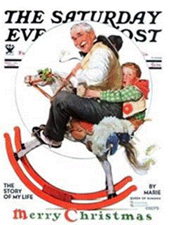
received was the Presidential Medal of In the late twenties and early thirties, most of Rockwell's Christmas covers were period pieces. In 1933 he turned to a contemporary but very traditional theme. Grandfather is making good use of his grandson’s new rocking horse. He has even purloined the boy's cowboy hat. This is a typical exploration of one of Rockwell's favorite themes. which was always changing—along with him. As circumstances became, theoretically at least, more hostile to his kind of traditional image-making, he rose to the challenge. His work became richer and more resonant, reaching a peak in the forties and fifties when most of the men who had been his rivals at the outset of his career were already long forgotten. His most remarkable quality was his ability to grow and adapt—to remain flexible—without ever modifying the basic tenets of his art. What seems to have enabled him to do this was a belief in the fundamental decency of the great majority of his fellow human beings. This belief was the most deep-seated of all his values, and it enabled him to perceive a continuity in behavior patterns undisturbed by shifts in social mores. The twentieth century has offered plenty of evidence of man's ability to shed his humanity, and Rockwell was certainly aware of this, yet he clung to his belief in decency. It was an article of faith, and it gave his work its particular flavor of innocence. Over the past hundred years or so, artists and critics have been ambiguous in their attitudes toward innocence. The "naive" vision of such painters as Henri Rousseau has been much prized, yet more schooled artists have often been led astray when they attempted to embrace such a vision (indeed it would be difficult for such a vision to survive schooling). Picasso, the most protean of all twentieth-century artists—greatly admired by Rockwell , it should be noted—was able to run the full gamut: from a childlike delight in transforming bicycle parts into the likeness of a bull's head to the nightmare vision of Guernica—but Picasso was, in every way, an exception to the rules. Rockwell's art has nothing, of course, to do with the innovations of modern painting. He was essentially a popular artist—an entertainer—and he was always fully aware that his work was intended to be seen in reproduction. The originals—generally painted on a relatively large scale—are, however, beautiful objects in their own right. He was looking to the general public rather than to a small, highly informed audience, and it was this perhaps that enabled him to sustain the innocence of his vision. Dealing with mass communication rather than the higher reaches of aesthetic decision-making, he has no place in the developing pattern of art history. It is futile even to compare him with American realists like Edward Hopper, whose subject matter occasionally had something in common with Rockwell 's. Hopper was always concerned primarily with plastic values, as is the case with any "pure" painter. Rockwell, on the other hand, had to think first and foremost about conveying information about his subject, as must be the case with any illustrator. An illustrator may, of course, have many of the same skills as the "pure" painter, but he deploys them in a different way. Essentially, he borrows from existing idioms of easel painting—whether traditional, as in Norman Rockwell's case, or more experimental, as was the case with his notable contemporary Rockwell Kent—and uses them as a means of conveying information. Interestingly, it is known that Norman Rockwell himself, during the twenties, was drawn to modern idioms—the result of a sojourn in Paris—but rejected them in favor of older conventions. The reason for this, we may suppose, was his recognition of the fact that his gift was not painterly at all (remarkable as his painterly skills were). It was, rather, his ability as a pictorial storyteller. Most of Rockwell's finest covers are, in effect, anecdotes. With occasional exceptions, he can give us only one scene—an isolated episode—but, in his mature work especially, the knows how to pack that scene with so much significant detail that the events that precede it, and follow from it, are, so to speak, latent in the single image. A great short story writer, like Guy de Maupassant, can conjure up a whole life within the span of a dozen pages. Rockwell, at his best, was capable of doing the same kind of thing with a single picture. Because of this he deserves to be thought of as something more than just an illustrator. An illustrator, by definition, is someone who takes another person's story (or advertising copy) and adds a visual dimension. Rockwell, in his cover art, went far beyond this. He was not only the illustrator, but also the author of the story. In his work, image and anecdote were inseparable; each sprang naturally from the other. It is perhaps easier to find parallels for Rockwell in the world of literature than in the world of painting. His world is full of echoes of Dickens and Twain, and he has much in common with O. Henry. It seems to me, though, that the writer Rockwell most resembles—despite enormous differences in cultural background—is P. G. Wodehouse, another perennial contributor to The Saturday Evening Post and Rockwell's senior by eleven years. Wodehouse was, of course, as quintessentially English as Rockwell was American. It's worth noting, though, that Wodehouse—a longtime United States resident—always kept his vast American readership in mind, peppering his stories with Americanisms that were far from current in his native country at the time Rockwell's skill with a paintbrush was a match for Wodehouse's deftness with a turn of phrase. Rockwell drew on American stock characters, just as Wodehouse drew on the British repertory, and—again like Wodehouse—placed them in a world free of malice. It's true that Rockwell found it harder to ignore happenings in the real world—as is clear in his wartime covers—but always he saw things in terms of the small crises of everyday life. Rockwell's protagonists come from backgrounds very different from those that produced Wodehouse's characters, but they have the same basic innocence. We might say that both men were genuinely incapable of perceiving evil, or at least of permitting it to intrude into their work. They represented worlds that may never have existed (though most of us wish they could have), and they made them believable. Rockwell never seems to have had much trouble sustaining such a rapport. His utopia and that of his audience were, to all intents and purposes, the same thing. He portrayed Americans as they chose to see themselves. It is easier to recognize this in his earlier covers—those painted prior to the late thirties, say—because, with few exceptions, they make no pretense at being anything but stylized representations of situations, amusing or touching, that play some more or less clever variation on an archetypal theme—the vagaries of young love, the compensation of old age, and so forth. We've met the characters who people these situations in the stories of Mark Twain and a thousand lesser writers (many of them published by The Saturday Evening Post). Rockwell brought to these stereotypes a crispness of vision and, within the limits set by the conventions he adhered to, a subtlety of characterization. Generally, in the first two decades of his career, the protagonists of his little dramas are portrayed with the minimum of props necessary to tell the story, silhouetted against a white background, the latter designed to accommodate and exploit the expansive magazine logos in style at the time. (More than was the case in his later career, Rockwell was obliged to be a designer as well as an illustrator. The two-dimensional blend of image and logo was at least as important as the treatment of the subject matter. It was this combination that made the individual cover stand out on the newsstand and sold magazines.) The figures in these earlier paintings are familiar icons, isolated from the context of the everyday world. As time passed, however, Rockwell became increasingly skillful at suggesting a broader context through the imaginative use of props. As
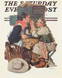
early as 1930 a documentary note crept into Rockwell's covers once in a
while. (In "Gary Rockwell had always drawn from life, and from 1937 on, he made extensive use of photography as an aid to capturing naturalistic poses. These were frequently real people—his family, friends, neighbors—and often the settings, too, were places that were familiar to him—houses, streets, and landscapes that were part of his everyday world. |
